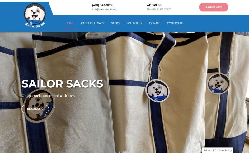
Sailor Sacks New Website
Since the beginning, Pink Dog Digital has been a dedicated supporter of local nonprofits. That is why the PDD team is honored to be announcing the launch of Sailor Sacks new website.
It is no wonder why Pink Dog Digital was beyond excited to begin working with Sailor Sacks. The “Sailor” in question is an adorable, fluffy emotional support Shichon pup.
Sailor’s owner, Rachel, battled breast cancer for 10 years before ultimately passing away in 2019. To honor her memory, Sailor Sacks was created as a way to support patients undergoing chemotherapy.
As with any organization, the mission statement is one of the most important aspects. It expresses what the organization does and the reasons behind it.
To showcase Sailor Sacks’ mission, the team at Pink Dog Digital designed the website so the mission would be front and center on the homepage.
Nonprofit organizations strive off of brand awareness and donations. To ensure visitors understand Sailor Sacks’ history and projects, PPD constructed the “Who Are We” section.
On the homepage, the “Who Are We” section is composed of three pillar pages: Rachel’s Legacy, Sacks, and Donate. Each section is complete with a corresponding photo, title, and brief blurb. By clicking on Read More, users are directed to the corresponding pillar page and encouraged to learn even more about the organization.
The key to great web design is pillar page consistency. The team at Pink Dog Digital was able to accomplish page consistency by following the same general format and utilizing identical visual elements.
Each page offers the same navigation menu, complete with the organization’s logo, contact information, address, and donation call-to-action button. This contributes to a sense of familiarity and trust for users. If the navigation was different colors or in a different location on each page, the user will assume they have been directed to a different website before exiting the page.
In addition to format, Pink Dog Digital also believes in the importance of the color scheme. Since the name Sailor brings about images of the ocean and water, the creative team at PDD decided to work with blue, pink, black, and white.
On each page, the headings are always white while the textual content is black. In addition to the navigation bar, all textual links are also blue. This ensures the links are distinct and can easily be identified. Given their bright pink color, the donation buttons can easily be found, no matter where they are located on the page.
This color scheme not only serves to create an overall aesthetically pleasing web design but also aids user usability. The contract between the background color and text color allows content to be easily understood. Even when there are headings over photos, the contrasting white text is easy to read over the vibrant background.
Pink Dog Digital is more than excited to be launching Sailor Sacks’ new website. Even though they are new to the nonprofit scene, PDD hopes their new online platform will help their mission flourish.


